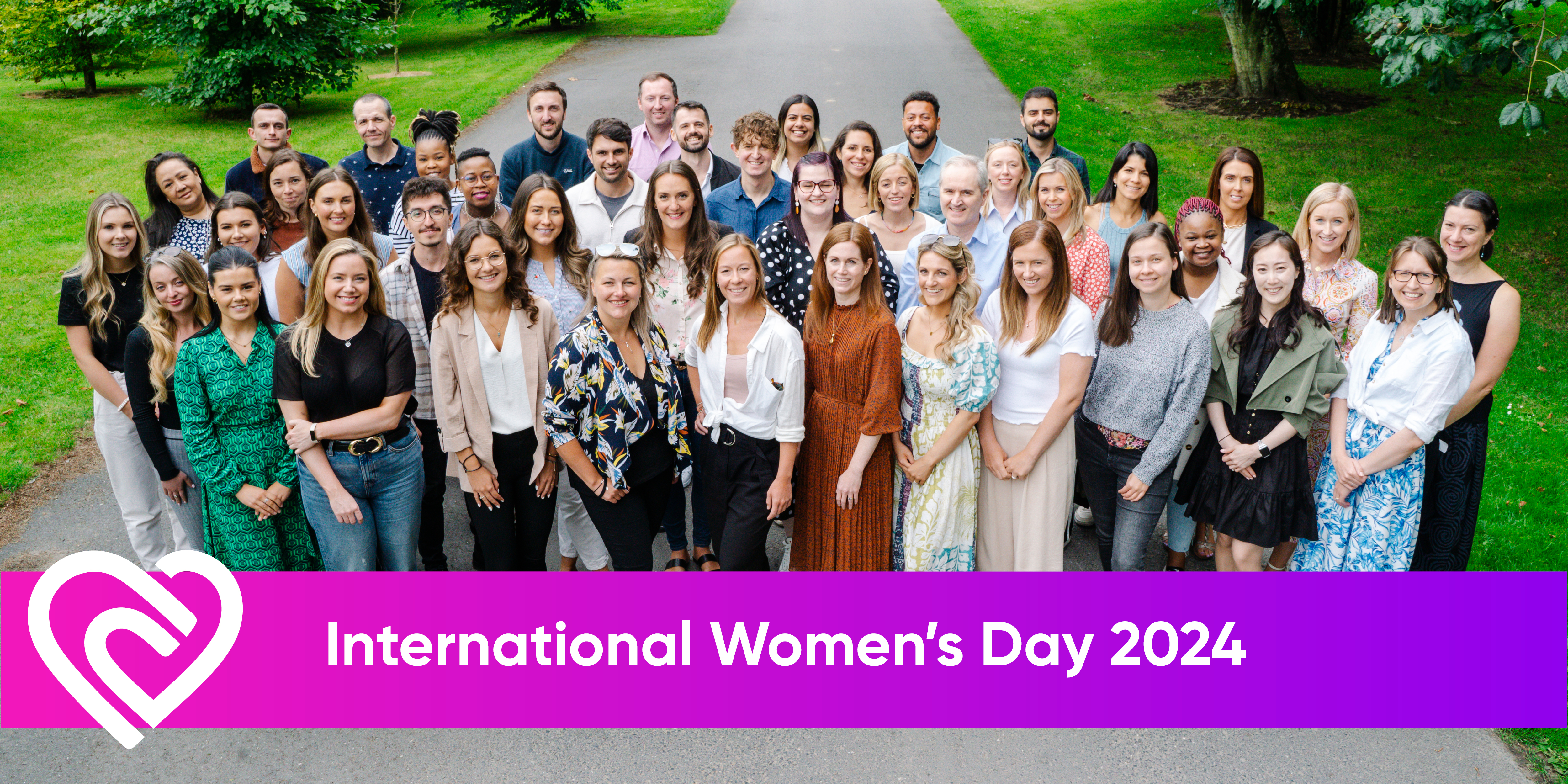
Net Affinity News Net Affinity honour International Women's Day 2024 International Women's Day is a holiday celebrated annually on March 8 as a focal point in the... Net Affinity 8 March 2024
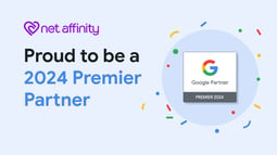
Digital Marketing, Net Affinity News Net Affinity has been named a 2024 Google Premier Partner Net Affinity
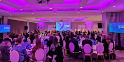
Net Affinity News Leading hotel tech specialist wraps up successful 2024 Revenue Summit in Dublin Net Affinity
Net Affinity 1 February 2024 Events Net Affinity Revenue Summit 2024 2 minute read Join us for a day of discussions and debate on the latest challenges facing our industry including...
Net Affinity 24 January 2024 Net Affinity News A podium finish: Leading hotel tech specialists named as third best hospitality marketing agency globally, whilst ranking best for resorts 2 minute read A leading hotel tech provider is in a celebratory mood after being named the third best hospitality...
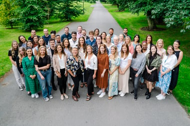
Net Affinity 16 January 2024 Net Affinity News We’ve Been Accredited as a Certified ‘Great Place to Work’! 1 minute read At Net Affinity, we're proud to announce our third consecutive accreditation as a certified 'Great...
Net Affinity 10 January 2024 Events, Net Affinity News The Net Affinity Team prepare for the Global Revenue Forum 1 minute read
Net Affinity 9 January 2024 Events, Net Affinity News Virgin Media Business Gold Medal Awards 2024 1 minute read
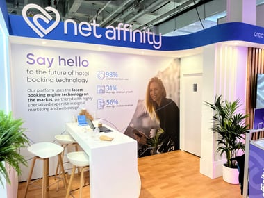
Net Affinity 14 November 2023 Events, Net Affinity News Net Affinity attend the Independent Hotel Show for the fifth year running 1 minute read
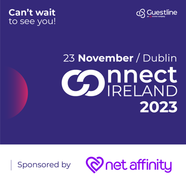
Net Affinity 14 November 2023 Events, Net Affinity News The up-and-coming Guestline Connect event 1 minute read This year Net Affinity is very excited and proud to sponsoring the Guestline Connect event in...